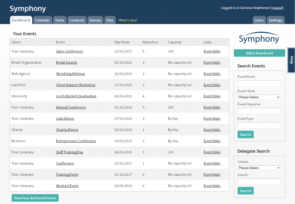
Symphony Redesign
We are pleased to announce the launch of our new UI design! The new design aims to give a more user friendly experience, with fully customizable colour options to suit any preference.
Just as we say in our mission statement, we aim to help event planners manage their events and focus on what’s important. And that means providing functionality and design that performs above the rest.

In the interest of transparency, we wanted to point out a few design elements and considerations that went into the design of the user interface:
Customizable colours
The update allows users to select from a range of colours when designing their interface. Allowing the ability to personalize the system to any preference.
Fonts
Choosing the correct font for the interface was truly important to the overall design. We decided to go for a larger/clearer font, allowing enhanced readability to all users.
Spacing
To ensure users can clearly see the functions of the interface, we have given adequate spacing throughout. Therefore, making the interface more scannable and user friendly.
We would like to give a huge thanks to our users for all the helpful feedback and support you’ve given us to make this new design possible.
If you have any comments, let us know what you think below.
